Mayflower Curling Club Brand Refresh
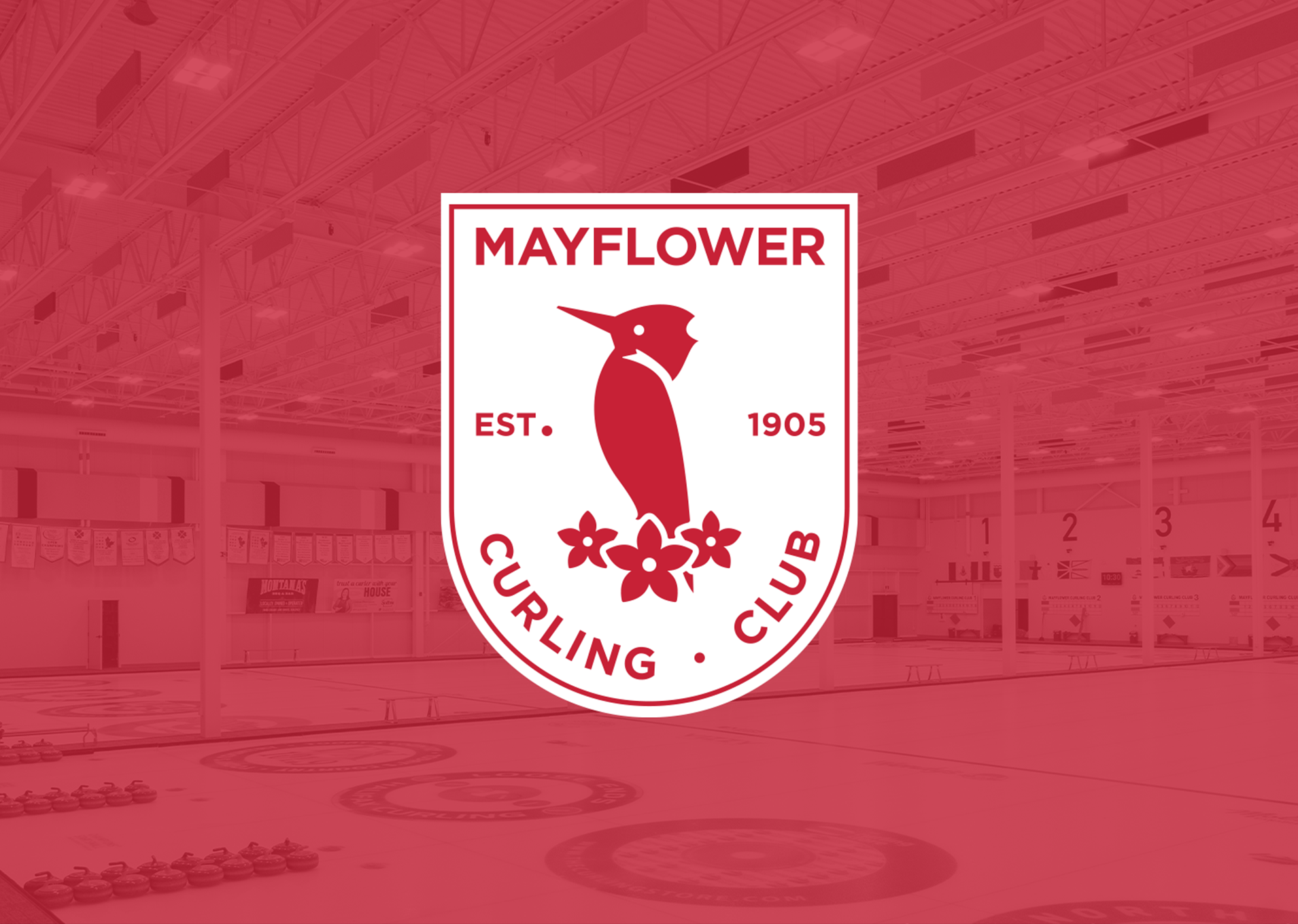
It’s not often you get the opportunity to rebrand an organization with more than a century of history. With the Mayflower Curling Club moving into a brand-new facility, it was time to reintroduce the club to a new generation of curlers.
Client
Mayflower Curling ClubServices
- Design
- Visual Identity Development


Rhyme + Reason developed a complete visual identity rooted in the Mayflower’s storied past, while positioning the club for the future. The logo was rebuilt from the ground up, preserving key elements but reimagined for a modern, digital-first world.
From there, we created a flexible brand system (typography, colour palette, and graphic elements) that works seamlessly across media and prove that heritage and progress really can be great teammates.

